Participation in New York State Accountability Testing
Created:
School-level accountability data for public schools in New York is available here in…Microsoft Access format. I have already cleaned and prepared these data for analysis, saved it locally, and loaded it into my environment. Most important for this analysis is that the data contain the percent of students participating in annual accountability testing in both ELA (English Language Arts) and math. I’ve subset the data to exclude secondary schools, since the landscape of testing is much different there. The data range from the 2007-2008 school year to the 2016-2017 school year. I’m going to aggregate the data at the county level. I will also do the district level in a moment.
## Find county-level means by year

partic_means <-
  nydata %>%
  group_by(county_name, year) %>%
  summarize(
    mean_ela = mean(ela_all_students_per_partic, na.rm = T),
    mean_math = mean(math_all_students_per_partic, na.rm = T),
    mean_overall = mean(c(ela_all_students_per_partic, math_all_students_per_partic), na.rm = T)
  )

glimpse(partic_means)
## Rows: 624
## Columns: 5
## Groups: county_name [63]
## $ county_name  <chr> "ALBANY", "ALBANY", "ALBANY", "ALBANY", "ALBANY", "ALBAN…
## $ year         <dbl> 2008, 2009, 2010, 2011, 2012, 2013, 2014, 2015, 2016, 20…
## $ mean_ela     <dbl> 0.9919231, 0.9966102, 0.9948387, 0.9947541, 0.9906557, 0…
## $ mean_math    <dbl> 0.9942308, 0.9969492, 0.9958065, 0.9950820, 0.9918033, 0…
## $ mean_overall <dbl> 0.9930769, 0.9967797, 0.9953226, 0.9949180, 0.9912295, 0…
So now we have counties, years, and mean participation rates in math, ELA, and overall. I need to get the shapefile for counties in New York. I will use the tidycesus package to do this. It’s easy and quick when geometry = TRUE.
ny_counties <-
  get_acs(
    state = "NY",
    geography = "county",
    variables = "B19013_001",
    geometry = TRUE
  ) %>%
  mutate(NAME = toupper(str_remove(NAME, " County, New York"))) %>%
  mutate(NAME = str_replace(NAME, "ST\\.", "SAINT"))
## Getting data from the 2014-2018 5-year ACS
I have to recode the NAME variable, which contains couunty names, to match how the names are stored in the accountability data (nydata)–county name in upper case. And I have to make sure that the spelling of “Saint” is consistent. Ideally, I would use the geoid, but the accountability data does not use census geoid–rather New York State’s own system of coding. Alas.
Finally, I will join the accountability data (nydata) to the county geometry data (ny_counties). This perserves the class of ny_counties as an sf object.
ny_cnty_partic <-
  ny_counties %>%
  left_join(partic_means, by = c("NAME" = "county_name"))
Rendering visulations of test participation
The data are ready to send to ggplot and gganimate. The geom_sf beautifully and quickly (especially with the lastest update to ggplot!) renders shapefiles. To animate the map to show each year in progression, I use the transition_manual function from gganimate. Simple! I use transition_manual rather than transition_time because year is not saved as a datetime object and I’m not bothering to change it! I slow the animate a bit using the fps argument in animate. By default fps = 10. There are ten frames in my animate. So it take 1 second to run the animation. I slow this by half, setting fps = 5.
p <-
  ny_cnty_partic %>%
  ggplot() +
  geom_sf(aes(fill = mean_overall)) +
  scale_fill_viridis_c(name = "Mean Participation Rate", option = "plasma", direction = 1) +
  labs(title = "Mean Participation Rate on Annual Accountability Tests",
       subtitle = "Year: {current_frame}") +
  transition_manual(year)

animate(p, fps = 5)
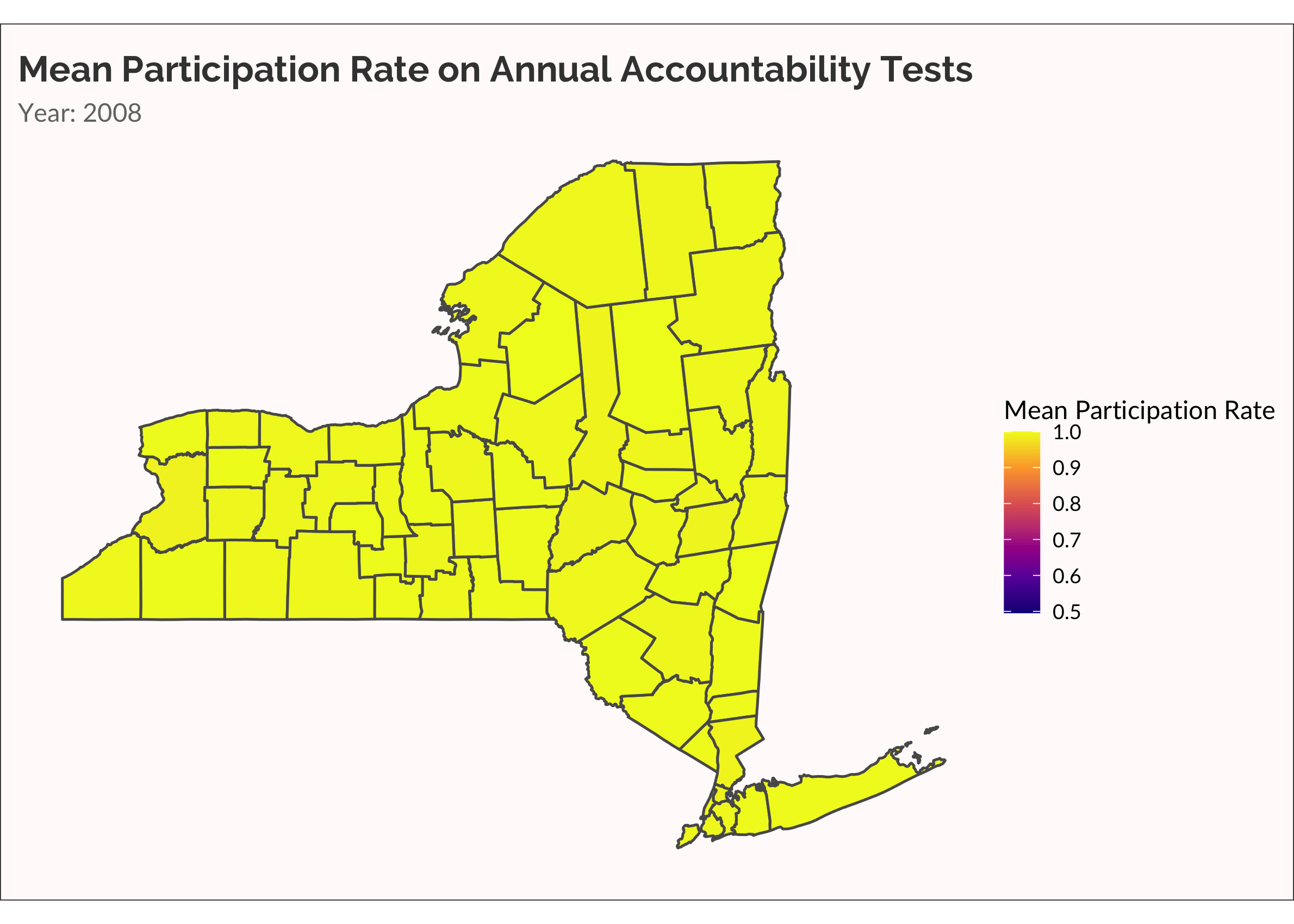
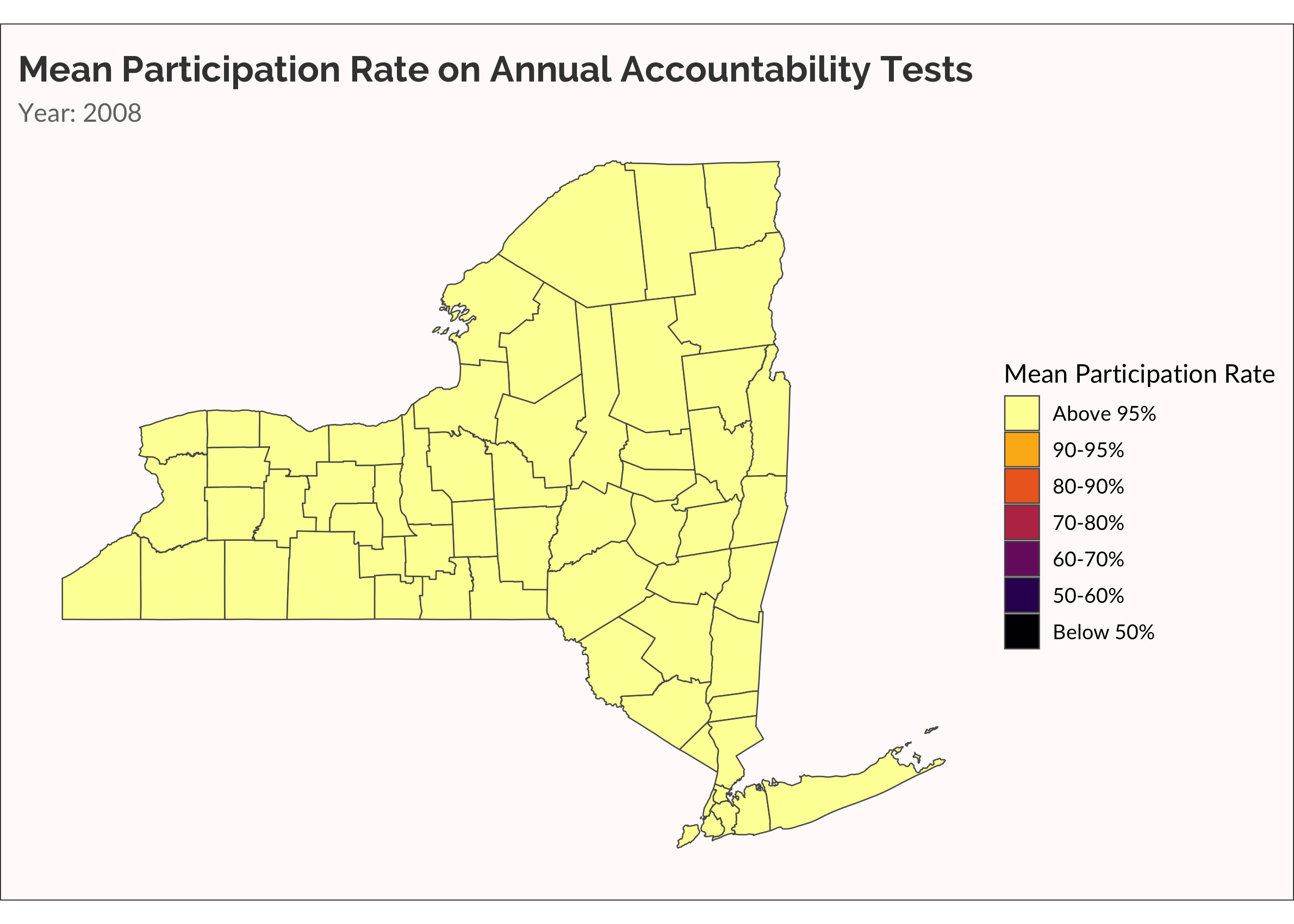
Another way to visualize the spread of non-participation over time is with a categorical variable, placing rate of participation into discrete buckets. This is useful for easily seeing which counties are low, medium, and high. Also, there are accountability rules that require schools to administer the tests to at least 95% of students. Dropping below 95% is therefore meaningful.
## Below X% categorical animation

cate_partic <-
  partic_means %>%
  mutate(
    cate =
      cut(
        mean_overall,
        breaks = c(0, 0.5, 0.6, 0.7, 0.8, 0.9, 0.95, 1),
        labels = c("Below 50%","50-60%", "60-70%", "70-80%", "80-90%", "90-95%", "Above 95%")
        )
    ) %>%
  mutate(
    cate = forcats::fct_rev(cate)
  )

ny_cnty_cate <-
  ny_counties %>%
  left_join(cate_partic, by = c("NAME" = "county_name"))

p <-
  ny_cnty_cate %>%
  ggplot() +
  geom_sf(aes(fill = cate), size = 0.25) +
  scale_fill_viridis_d(name = "Mean Participation Rate", option = "inferno", direction = -1) +
  labs(title = "Mean Participation Rate on Annual Accountability Tests",
       subtitle = "Year: {current_frame}") +
  transition_manual(year)

animate(p, fps = 5)
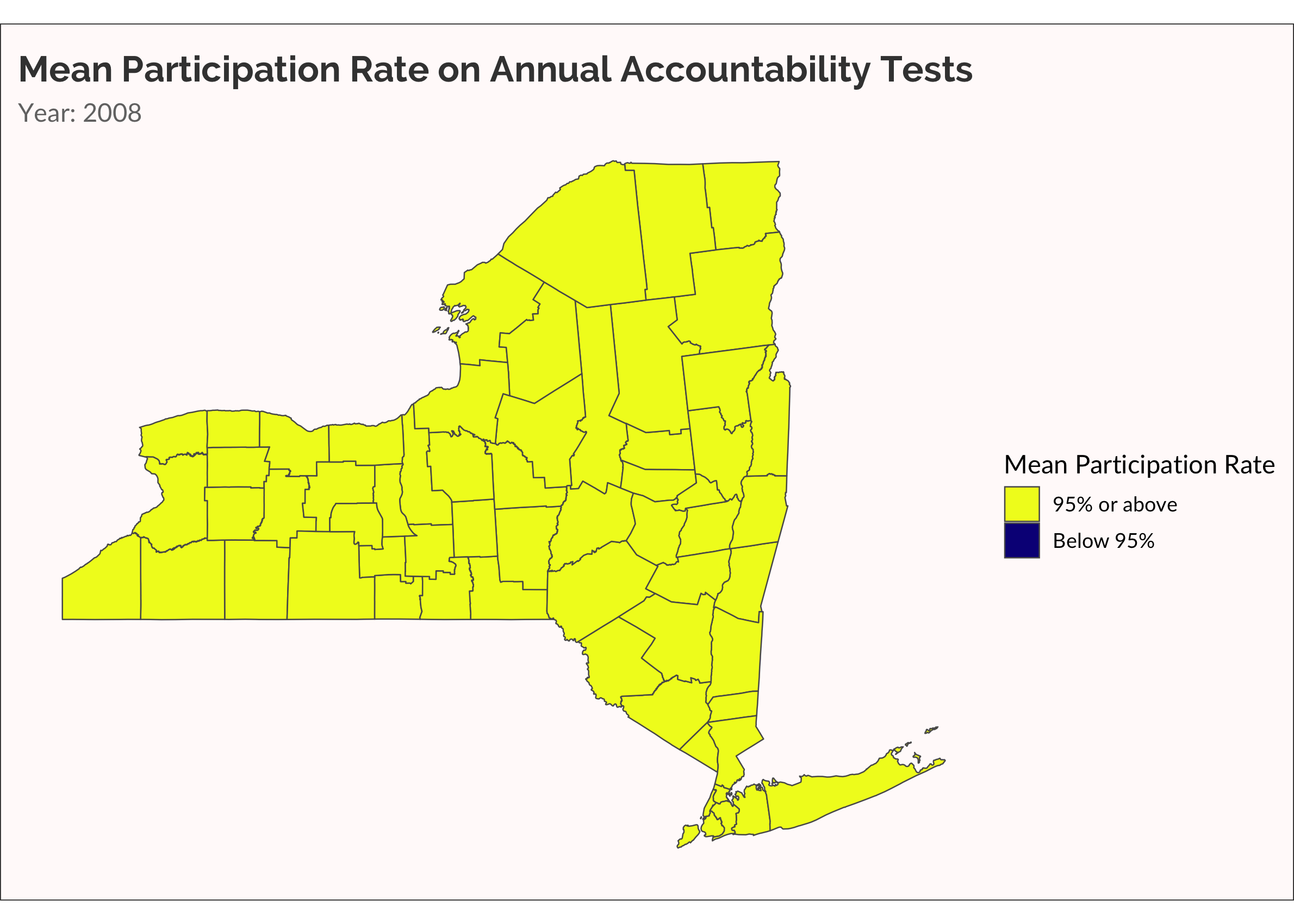
One more time, let’s make something akin to a survival analysis. Well, not really. Let’s just visualize when a county has a mean participation rate that drops below 95%.
cate_partic <-
  partic_means %>%
  mutate(
    cate =
      ifelse(mean_overall < 0.95, "Below 95%", "95% or above")
    )

ny_cnty_cate <-
  ny_counties %>%
  left_join(cate_partic, by = c("NAME" = "county_name"))

p <-
  ny_cnty_cate %>%
  ggplot() +
  geom_sf(aes(fill = cate), size = 0.25) +
  scale_fill_viridis_d(name = "Mean Participation Rate", option = "plasma", direction = -1) +
  labs(title = "Mean Participation Rate on Annual Accountability Tests",
       subtitle = "Year: {current_frame}") +
  transition_manual(year)

animate(p, fps = 5)